

Do you feel like as you get older, there are fewer events in life that you really get excited for? For example, my 36th birthday came and went a couple weeks ago, and I barely remembered to celebrate. On the flip side, there are some events, that as I age, I seem to anticipate more and more…my monthly massage, 4th of July, and…the annual announcement of Pantone Color of the Year! While it may seem like insignificant news, in the design world, this one announcement has a trickle down effect that impacts major decisions in the years to come. So, when the Pantone Color of the Year is finally released, you can only hold your breath and cross your fingers that it’s a color you’re excited about and anxious to incorporate into your style. And in my opinion, 2019 did not disappoint.

Living Coral. It’s bright. It’s cheerful. It’s happy. And it’s just what we need right now. Whether we need cheering up from the dreary weather outside, or we need a bright disposition to forget about the current political climate, or we just like anything that makes us feel happy, this color is sure to be the perfect remedy.

Oh yeah, and it’s a pretty great choice when it comes to interior design. But you don’t have to take it from me, you can look at any of the major home stores, interior design firms or textile companies and you can see that they have already adopted this color into their work.
Below are a couple examples of companies that have already taken to the news.
Thibaut:
Bathrooms are the ideal room to take a design risk. Because they are small and closed off from the rest of the house, you can be a bit more daring with your decisions. Jellyfish wall covering? Why not?!


Quadrille:
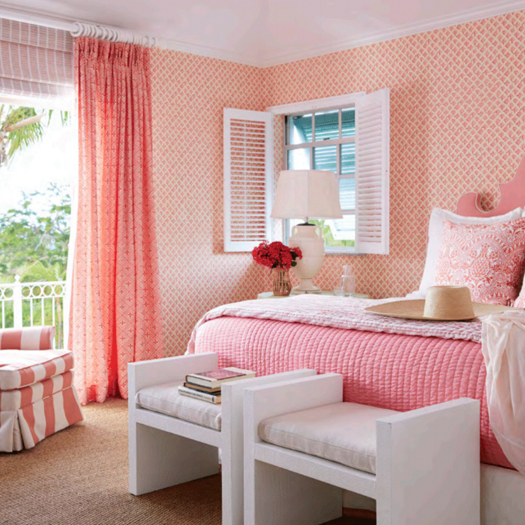
These two bedrooms illustrate two very different ways to incorporate in coral. The first bedroom takes an ‘all-in’ approach. From walls to window treatments to upholstery, coral takes the front and center in this space.

The second bedroom takes a bit more subtle approach with adding in coral. Small pops here and there help to add cheerfulness and brightness to the space, but don’t overpower the overall room.

Schumacher:
The Chang Mai Dragon print has been a longtime favorite of mine. You can literally pull almost any color from the fabric and can take a room’s feel in so many different directions. Both of the examples below show how to play off this print with pops of coral.


All right, so you’re now dedicated to adding some coral into your space. The next question is what colors work best with coral? A general rule of thumb when decorating is to combine colors on the opposite ends of the color wheel. Coral is a mix between orange and red, whose complimentary colors are blue and green, respectively, so anything in the blue/green family is a safe choice.
Below are a couple examples from Ballard Designs that illustrate the subtle approach to this method, and the not-so-subtle approach.

 So, to be honest, I have yet to paint a piece of furniture in coral! I have definitely been inspired by some coral pieces I have seen, but have just never taken the plunge. However, with this announcement, you can be sure we are going to add some coral pieces to our inventory!
Check out some of these examples below.


Are you feeling inspired yet?! If there is a specific shade of coral that you are hooked on, I’d love to hear about it!